
ConvertIt
Lead UX Designer
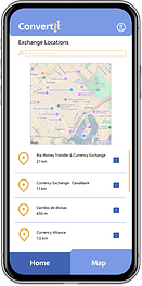
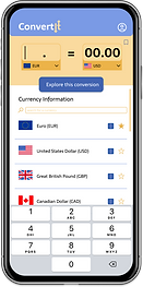
I created the concept of ConvertIt, a well as its brand identity, to design a corresponding mobile app in Figma that allows global travelers to find current exchange rates between any two currencies via an optimized user experience. They can also find the nearest location to exchange between two currencies using this app.

Ideate
Personas & Wireframes
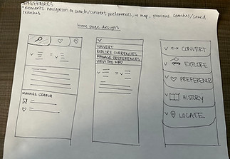
The project scope was shaped around two key user personas, each representing a target audience segment. Based on their goals and needs, paper wireframes were developed to reflect and support their primary objectives. After their initial creation, these paper wireframes were converted into digital wireframes using Figma.
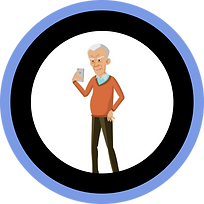
Benjamin
"I desire an app that makes exchange rates and exchange locations quickly accessible when I’m on the go.” Context: Benjamin is an Austrian university professor who travels often to attend seminars at other universities within Europe. Benjamin’s priority is finding a healthy work, family balance. He would like a currency exchange app that isn’t cluttered, allowing him to access exchange rates and locations quickly when he is on the go. Goals: - Benjamin wants to access exchange rates quickly on the go. - Benjamin would like a map of the best exchange rates near him. Frustrations: - Benjamin dislikes cluttered interfaces. - Benjamin would like easy readability, to account for the fact that he experiences vision impairment.
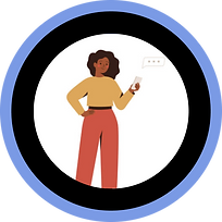
Vivian
“I’m worried I won’t have access to exchange rates when I don’t have cell service.” Context: Vivian is a 25-year-old small business owner in a rural Kansas town who enjoys travelling internationally for enjoyment. There are times when she is travelling in which she does not have cell service, so she is worried that she would not have access to exchange rates. She also would like help in deciphering exchange rate meaning. Goals: - Vivian would like to be able to favorite currencies. - Vivian would like to be able to save exchange rates so she can access them later. Frustrations: - Struggles to contextualize exchange rate meaning.


Test
Lo-Fi Prototype & Usability Test
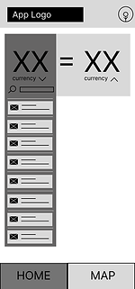
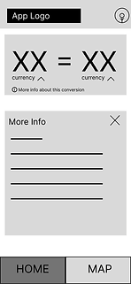
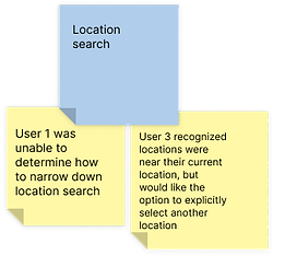
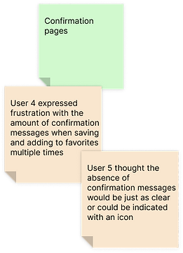
The paper wireframes from the "Ideate" design phase were converted into digital wireframes. From these digital wireframes, a low-fidelity prototype containing flow was constructed. An unmoderated usability test was conducted with five users to identify potential areas of improvement within the existing prototype of the app, and an affinity diagram was created to synthesize the findings.


Create
Mockup & Hi-Fi Prototype
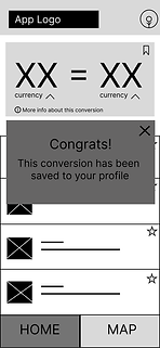
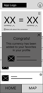
The findings from the affinity diagram in the "Test" design phase were implemented to create mockups and a high-fidelity prototype. Color was added-- blue to evoke trust, and yellow to promote optimism in users-- and branding for ConvertIt was created. A second usability test was conducted and based on those results, the mockups and prototypes were updated, as shown below.
.png)


Iterate
Project Insights